

Art of the Ninja
Exploring the Printing Process
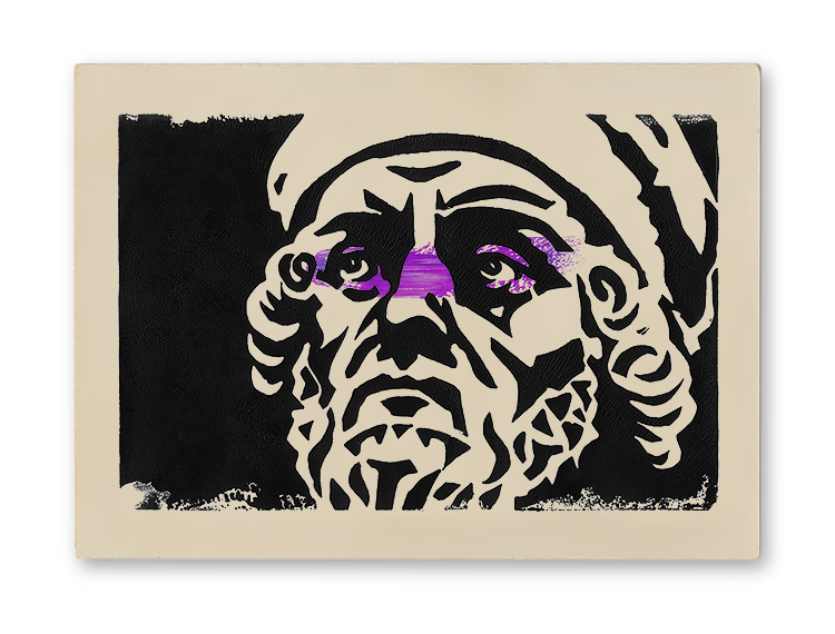
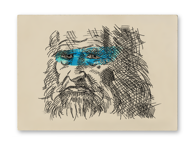
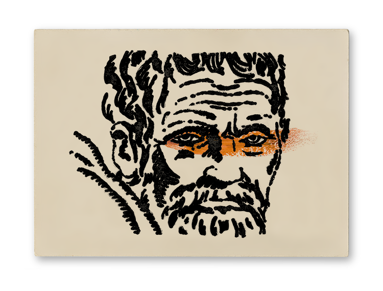
While looking into creating an operation for printing simple wooden business cards at home, I was introduced to the four traditional printing methods, intaglio, flexography, lithography, and serigraphy. This project was designed to test their individual suitability and determine the pros and cons of each process. Each of the four methods was used to create a depiction of a renaissance master, and then a stroke of colour was added to represent the mask of their corresponding turtle.

Leonardo
Intaglio- A printing process utilizing a lowered image or “etch”. The positive space of an image is scratched or cut into a rigid substrate. This material is then rolled with ink filling the etched crevices. The surface is wiped clean before being pressed with paper which picks up the ink printing the image. The primary advantage of intaglio printing is the ease with which an original image can be reproduced.

Raphael
Serigraphy- A printing process utilizing a stencil or “screen”. The positive space of an image is removed from a thin flexible substrate to create a stencil. This screen is then used to block the negative space of an image while an ink roller is pressed across the substrate leaving the design on the paper below. The primary advantage of serigraphy is its versatility as the screens can be applied to non-planar objects.

Donatello
Flexography- A printing process utilizing a raised image or “relief”. The negative space of the desired design is cut out of a substrate leaving the image on the surface. The material is then coated in ink and a piece of paper rolled or pressed onto the substrate printing the design. The primary advantages of flexography are the speed of the printing process and its ability to be applied to almost any material.

Michelangelo
Lithography- A printing process utilizing the chemical immiscibility of two liquids, such as wax and water. The positive space of an image is drawn on a porous substrate using a waxy material and then wiped clean. Water is then applied which is repelled by the wax, and an immiscible ink is applied which in turn is repelled by the water. Paper is then pressed into the substrate duplicating the image. The primary advantage of lithography is its ability to render sharp images quickly.

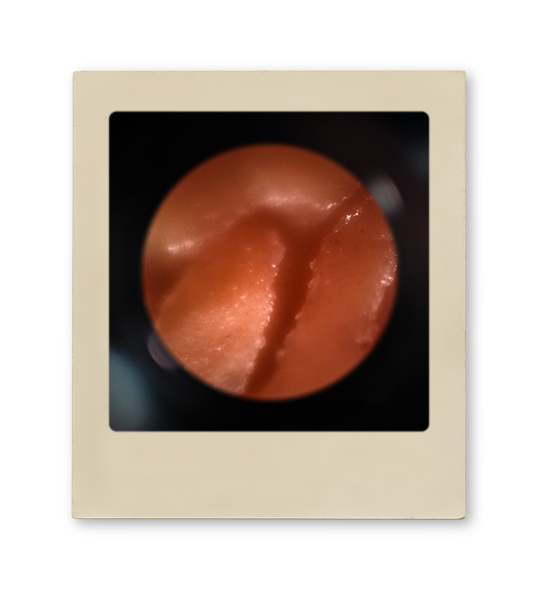
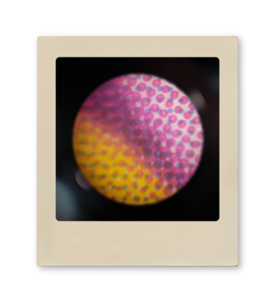
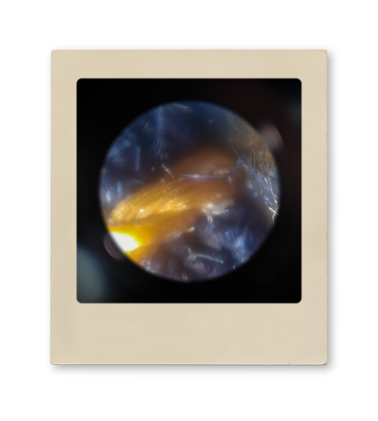
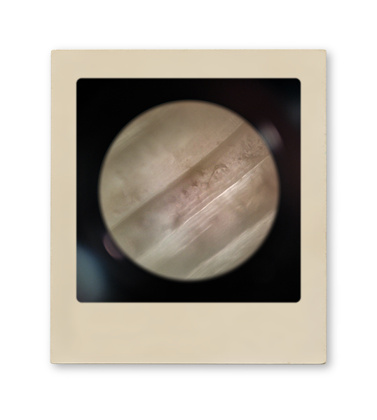
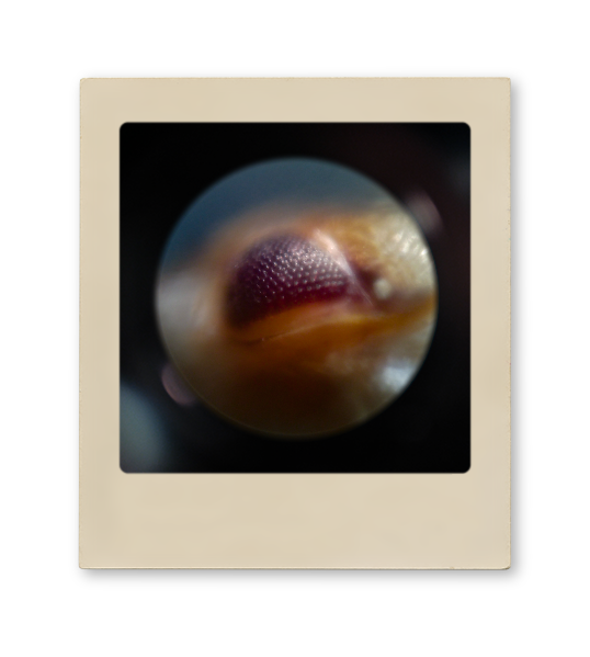
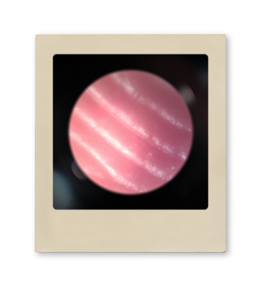
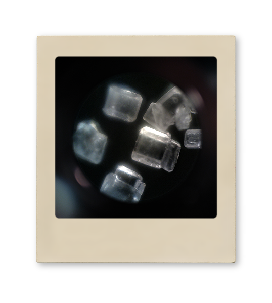
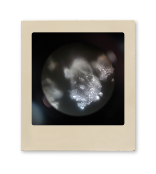
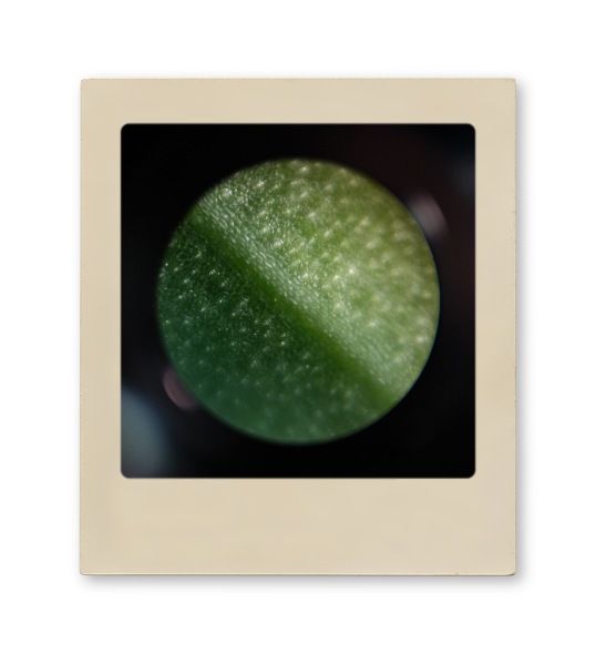
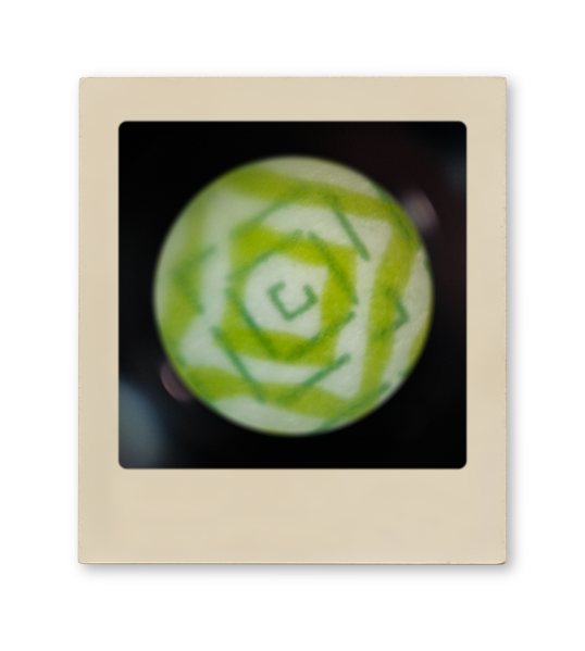
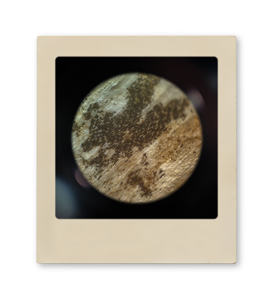
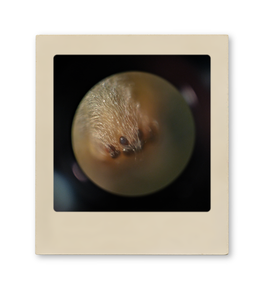
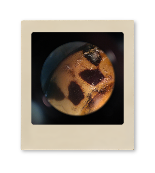
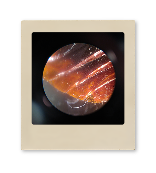
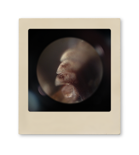
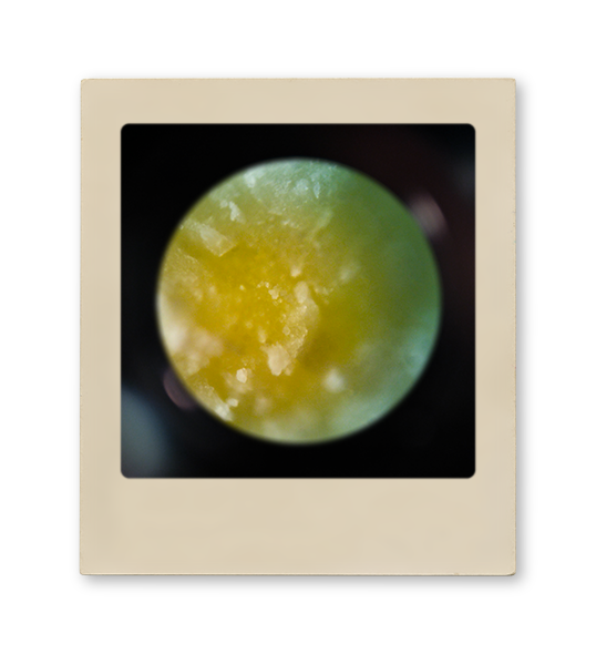
Under the Lens
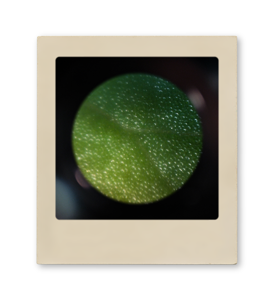
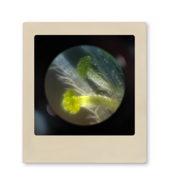
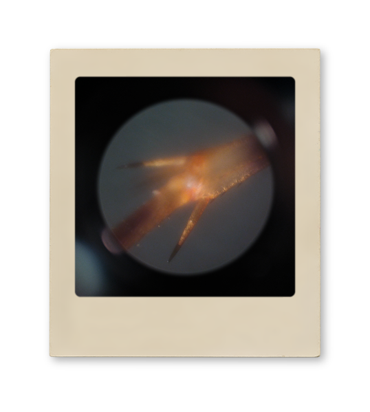
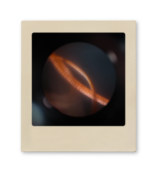
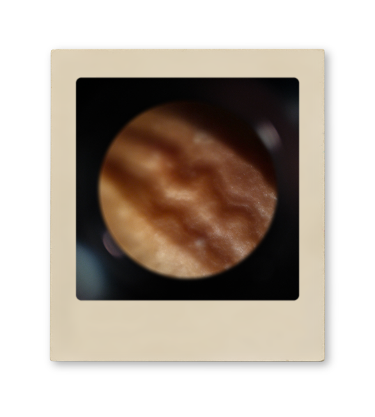
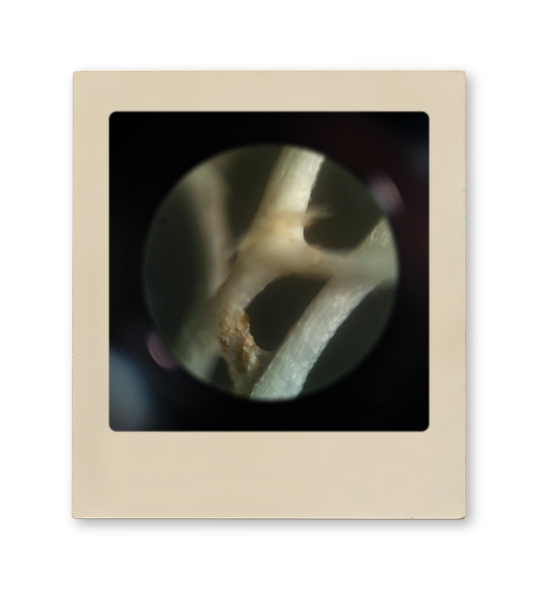
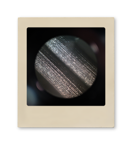
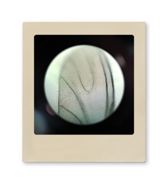
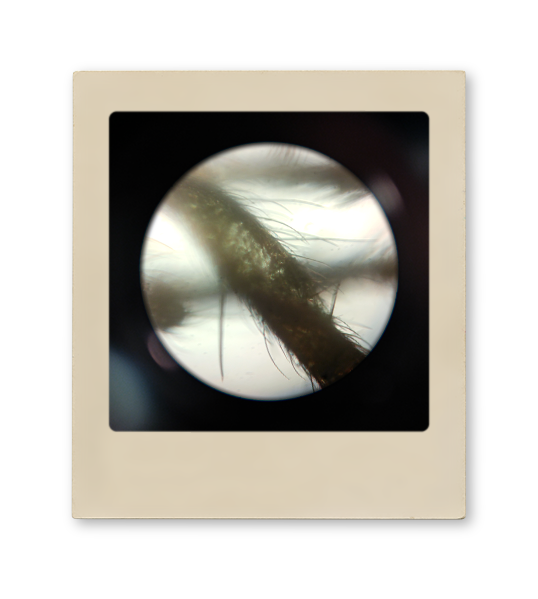
Macro And Micro
When my great uncle Major General J.W.B. Barr died he left me his medical microscope. While it is one of my favorite possessions, and I have always kept in on display, it has not gotten a lot of use. I decided it was time I figured out what it could do. Every day for three months I found an object from around the house and photographed it beneath the lens. The gallery on the left contains my favorite 25 images.


Paint To Pixel
Reimagine Digital Painting
Traditionally when people refer to digital painting they are referencing the use of a tablet and stylus to imitate brush strokes digitally on a screen. I wanted to try something a little different — turning real paint into pixels.

Library
The first step in the process was asset creation. Using a mix of watercolour, acrylic, and oil paints I created a library of 150 strokes, shapes, splotches, and drips. I tried to keep the forms rough and raw, as the small errors in their texture create an individuality near impossible to recreate digitally. These assets were then scanned at 1200dpi and isolated in Photoshop to create a library of pixelized paint.

Typography
With the library created I could now bend, twist, and layer the strokes to create truly realistic looking digitally painted works. My first creation was a “hand-painted” font. Using a thick Helvetica as inspiration I began manipulating the paint to create the individual strokes of the letters. Once the forms were completed I added shadows where the strokes overlapped to create the illusion of depth.

Augmentation
Once the font was finished I experimented with photo augmentation. I started with a minimalist picture I had taken of the CN tower. I crushed the image and removed as much texture as possible to leave only a colour-blocked representation of the photo. I then layered painted assets to rebuild the texture and used a watercolour form as a mask.

Painting
The final challenge was attempting to paint entirely from scratch. I decided to create the image of an orca breaching the surface of the ocean — inspired by the colouring in the assets. I began by transforming a series of black strokes to create the body’s form and fins, which were then layered over blue splashes to create depth. I used two large strokes to create the water and sky, with watercolor forms to represent clouds. The final Image was then masked onto a photo card which can be viewed above.